


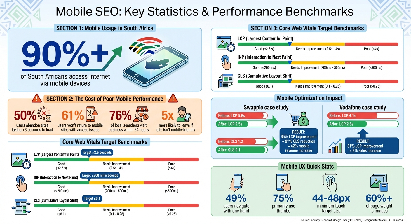
Did you know that over 90% of South Africans access the internet via mobile devices? With mobile-first indexing, Google now evaluates your site based on its mobile version. If your site isn’t mobile-friendly, it risks poor rankings, less traffic, and lost conversions. Here’s the bottom line: a fast, user-friendly mobile experience is essential for SEO success.
To make your site mobile-friendly, focus on these key areas:
- Responsive Web Design: Use CSS media queries and the viewport meta tag to ensure your site works across all devices.
- Mobile-First Design: Prioritise essential content for smaller screens, then enhance for larger devices.
- Faster Load Speeds: Compress images, minify files, and enable browser caching to reduce delays.
- Optimised Navigation: Design menus for thumb-friendly use and limit intrusive pop-ups.
- Readable Content: Break text into short sections, choose legible fonts, and ensure high contrast.
Pro Tip: Use tools like PageSpeed Insights and Google Search Console to monitor and improve your site’s mobile performance. Address Core Web Vitals – like Largest Contentful Paint (LCP) and Cumulative Layout Shift (CLS) – to boost both user experience and rankings.
Start optimising your mobile site today to stay ahead in South Africa’s mobile-driven online landscape.
Mobile SEO Statistics and Core Web Vitals Benchmarks for South Africa
Mobile SEO: The Ultimate Guide for Beginners
sbb-itb-6f8605a
Use Responsive Web Design
Responsive Web Design (RWD) ensures your website looks and functions well across devices, from compact smartphone screens to large desktop monitors. By relying on CSS media queries, RWD adapts your site’s layout dynamically, using a single HTML and URL for all devices.
Google favours this approach because it simplifies the process of crawling and indexing your site. It ensures consistent HTML across devices, which aligns perfectly with Google’s mobile-first indexing strategy. Plus, it eliminates the risk of duplicate content issues.
To implement RWD, start by adding the viewport meta tag to the <head> of your HTML:
<meta name="viewport" content="width=device-width, initial-scale=1"> This tag ensures mobile browsers display your page at the correct scale. Additionally, CSS properties like max-width: 100% and height: auto prevent horizontal scrolling, keeping layouts clean and user-friendly.
Apply CSS Media Queries
Media queries, defined with the @media rule, allow you to adapt your site’s CSS based on specific viewport characteristics, such as screen width. Here’s an example of a basic media query:
@media (min-width: 40em) { /* Styles for viewports 40em and wider */ } When setting breakpoints, focus on when your layout starts to break rather than using arbitrary screen sizes. Using relative units like em or rem ensures flexibility. You can also combine conditions with logical operators like and (to meet multiple criteria) or commas (to provide alternatives). This naturally supports a mobile-first approach, where essential content takes precedence as screen sizes grow.
Design Mobile-First
A mobile-first design strategy starts by creating layouts for smaller screens and then enhancing them for larger devices. With this method, your default CSS caters to mobile users, and additional complexity is introduced with min-width media queries for bigger screens. This forces you to focus on what matters most – essential content and functionality.
This approach doesn’t just improve the user experience; it aligns with Google’s mobile-first ranking system. It also addresses mobile-specific challenges like slower networks by promoting simpler code and faster load times. By ensuring core content, structured data, and metadata are easily accessible on mobile, you create a streamlined, effective experience for all users.
Improve Page Loading Speed on Mobile
When it comes to mobile browsing, page loading speed is just as important as having a responsive design. It plays a huge role in both search rankings and user experience.
Google has considered site speed a ranking factor for desktop since 2010 and for mobile since 2013. But here’s an even bigger issue: nearly half of users will leave a mobile site if it takes more than 3 seconds to load. That’s a double hit – poor rankings and lost customers.
Mobile users face unique challenges. 4G networks have an average latency of 100 milliseconds per request, and mobile devices often lack the processing power of desktops. Just a one-second delay can disrupt user engagement. To keep users interested, aim for your above-the-fold content to load in under one second.
The business impact of slow-loading pages is clear. They lead to higher bounce rates, less time spent on-site, and lower conversion rates. Slow sites also risk fewer pages being crawled by search engines, which can hurt indexation. Ideally, your server response time should be under 200 milliseconds, and your total mobile page load should finish within 3 seconds.
Compress Images and Files
Media content often takes up the bulk of a webpage, so optimising it is a must for faster loading times.
Images alone make up over 60% of the average page’s content. Compressing images using lossless or lossy methods can reduce file sizes without affecting quality. For mobile users, use CSS media queries with background-image to load appropriately sized images.
Switching to modern formats like WebP or AVIF can also cut down file sizes compared to older formats like JPEG or PNG. Use the loading="lazy" attribute to delay loading offscreen images and videos until they’re needed. Additionally, the srcset and sizes attributes ensure users get images properly scaled to their device’s screen.
Beyond images, you can minify CSS, HTML, and JavaScript files by removing unnecessary spaces, comments, and characters. Tools like CSSNano or UglifyJS can help with this. For text-based files larger than 150 bytes, enable Gzip or Brotli compression. If you rely on heavy JavaScript libraries, consider lighter options – Zepto.js, for example, is just 5 KB compared to jQuery’s 30 KB compressed size.
Enable Browser Caching
Browser caching can make a big difference by storing static files like stylesheets, images, and JavaScript on users’ devices. This way, those files don’t need to be downloaded again on subsequent visits. As Billy Hoffman, Founder of Zoompf, puts it:
"Really smart web developers avoid the need to download those resources in the first place. This is where browser caching comes in."
Set "expires" headers for static resources and allow caching for up to a year for files that don’t change often. For content that’s updated more frequently, use shorter cache periods or employ cache-busting techniques by adding version numbers to filenames.
Monitor Speed with Testing Tools
Testing is essential to identify bottlenecks and track your progress. Google PageSpeed Insights is a great tool that provides mobile-specific diagnostics, a performance score, and practical recommendations. It even uses real-world data from the Chrome User Experience Report. Run tests in incognito mode to avoid interference from browser extensions or cached data.
Lighthouse, available in Chrome DevTools, delivers detailed audits for performance, SEO, and accessibility. These audits are a core part of any comprehensive SEO checklist. It offers different modes, including navigation audits, "Timespan" for tracking interactions, and "Snapshot" for analysing the current page state.
WebPageTest is another useful tool for evaluating caching, time to first byte (TTFB), and content delivery network (CDN) performance.
Pay close attention to Core Web Vitals. These include:
- Largest Contentful Paint (LCP): Should be under 2.5 seconds.
- Interaction to Next Paint (INP): Should stay below 200 milliseconds.
- Cumulative Layout Shift (CLS): Should be under 0.1.
When testing, simulate real-world conditions by using low bandwidth and high latency settings. Also, disable browser caching during first-load audits to get an accurate baseline.
Every optimisation step – whether compressing files or enabling caching – contributes to a faster, more user-friendly mobile experience.
Structure Content for Mobile Users
Once you’ve optimised your site’s load speed, the next step is making sure your content is easy to read and navigate on small screens. Mobile users tend to skim content in short bursts, and if they feel overwhelmed, they’ll leave. Research indicates that people typically read only 20% to 28% of a web page’s content, with scanning being even more common due to the challenges of reading on digital screens.
This is crucial for SEO because poor engagement from mobile users can negatively impact rankings. If mobile visitors find your content difficult to read and quickly return to search results, Google’s RankBrain algorithm may interpret this as a poor user experience. Use the following digital marketing strategies to structure your content in a way that keeps mobile readers engaged.
Break Content into Short Sections
Mobile screens are limited in space, so it’s essential to divide your content into smaller, easily digestible sections. This makes it more user-friendly for readers who consume content in quick scans.
- Keep paragraphs to five lines or less and stick to short sentences. Long text blocks can feel overwhelming on a small screen, causing readers to skip over them.
- Use clear subheadings to signal what each section is about. This helps users quickly locate the information they need without unnecessary scrolling.
Consider the "bite, snack, meal" approach to structure your content. Start with a headline that grabs attention (the bite), follow it with a brief summary or key takeaway (the snack), and then offer a more detailed explanation (the meal). This format caters to different reading preferences – whether someone just wants a quick overview or a deep dive into the topic.
Select Readable Fonts and Colours
Typography plays a huge role in how easily mobile users can read your content. Start with a base font size of at least 16px for body text to avoid forcing users to zoom in. Pair this with a line height between 1.5 and 1.65 to prevent the text from feeling cramped, and steer clear of tight letter-spacing, which can make characters harder to distinguish on small screens.
For line length, aim for 45 to 75 characters per line, with 66 being the sweet spot. As Robert Bringhurst explains in The Elements of Typographic Style:
"Anything from 45 to 75 characters is widely regarded as a satisfactory line length for a single-column page set in a serifed text face in a text size. The 66-character line (counting both letters and spaces) is widely regarded as ideal."
High text-to-background contrast is non-negotiable. Mobile users often view content in bright sunlight or on lower-quality screens, so ensure your text remains clear and legible. Stick to system fonts (e.g. system-ui) to reduce load times. If you must use custom fonts, limit them to a few essential weights, as each additional font file adds to your page’s load time.
For fluid typography, use the CSS clamp() function to ensure text scales smoothly across different screen sizes. This keeps your content readable on everything from small phones to tablets. Always test your typography on real devices, especially budget smartphones, as they can reveal legibility issues that might not appear in development tools.
Properly structured content and thoughtful typography aren’t just about aesthetics – they’re key to creating a mobile-friendly experience that boosts SEO and keeps users engaged.
Make Mobile Navigation Easy
After focusing on optimised content and fast load speeds, it’s crucial to ensure your mobile navigation works seamlessly – especially for one-handed use. This not only keeps users engaged but also aligns with your mobile-first SEO goals.
Here’s why this matters: 49% of users navigate devices with one hand, and 75% primarily use their thumbs. If your site forces users to stretch their thumbs awkwardly or adjust their grip, they might just leave. To avoid this, design your navigation around the "Natural Zone" – the area from the bottom-centre to mid-screen where thumbs naturally rest. Apps like Instagram and Spotify get this right by placing their main navigation in a bottom tab bar, instead of tucking it away in a hard-to-reach hamburger menu. As Stuart L. Crawford, Creative Director at Inkbot Design, explains:
"Real Mobile UX is about physiology… If they have to contort their thumb to reach your ‘Add to Cart’ button, they won’t buy it".
To make navigation more user-friendly, follow these best practices:
- Ensure touch targets are 44–48 pixels in size to accommodate finger pads and minimise accidental taps.
- Space links or buttons at least 32 pixels apart to avoid misclicks.
- Limit menu options to four to eight items – more than that becomes overwhelming on small screens.
- Provide visual feedback, like a colour change or animation, when users tap buttons so they know their actions are registered.
These ergonomic tweaks create a smoother experience, especially for key calls-to-action.
Design for Thumb-Friendly Interaction
Place important calls-to-action – like "Add to Cart", "Contact Us", or "Search" – in the lower half of the screen where thumbs naturally reach. Avoid putting critical navigation elements or back buttons in the top corners, as they’re harder to access without shifting grip. Sticky headers or footer CTAs (calls-to-action) can also keep essential options visible while users scroll.
Simplify your menu structure. Instead of multi-layered menus suited for desktops, focus on the most common actions mobile users need. For larger websites, a prominent search bar can help users find what they’re looking for quickly without wading through endless categories. This is especially important since visitors are five times more likely to leave a site if it isn’t mobile-friendly. Every friction point you remove improves both the user experience and your SEO.
Once the layout is optimised, it’s also important to minimise disruptions that could frustrate users.
Reduce Pop-Ups and Interruptions
Google has been penalising intrusive mobile interstitials since January 2017. These full-screen pop-ups block access to content and irritate users. As Google stated:
"Starting today, pages where content is not easily accessible to a user on the transition from the mobile search results may not rank as high".
If you need pop-ups, keep them user-friendly. Use small banners at the top or bottom of the screen, trigger them after a delay or scroll, and make sure the close button is easy to spot. A 24×24 CSS pixel target for the close button with high contrast ensures users can dismiss the pop-up without frustration. Poorly executed pop-ups can also disrupt Core Web Vitals, causing issues like Cumulative Layout Shift (CLS) or slowing down Interaction to Next Paint (INP) – both of which are critical for rankings.
Essential overlays like cookie consent banners or age-gates are generally exempt from penalties, but they should still be thoughtfully designed. Use overlays instead of redirecting users to separate pages, and avoid pushing your main content below the fold. Set limits so dismissed pop-ups don’t reappear repeatedly during the same session. The goal is simple: let users access your content without unnecessary barriers, and you’ll improve both their experience and your search rankings.
Test and Track Mobile Performance
After fine-tuning your site’s speed and navigation, the next step is regular testing to ensure your mobile site stays competitive. With mobile-first indexing now a standard, consistent mobile performance is a must for maintaining search rankings. While Google’s Mobile-Friendly Test tool is no longer available, you can rely on tools like PageSpeed Insights and Google Search Console to keep tabs on your site’s performance.
PageSpeed Insights offers two key types of data: Lab Data, which uses Lighthouse simulations to identify potential issues, and Field Data, which reflects actual user experiences. To meet Core Web Vitals standards, your site’s 75th percentile scores for LCP (Largest Contentful Paint), INP (Interaction to Next Paint), and CLS (Cumulative Layout Shift) should all fall in the "Good" range. This ensures a smooth experience for most users, even those with older devices or slower connections.
Run Google’s Mobile-Friendly Test
To test your mobile performance, head to PageSpeed Insights, enter your full URL (including "https://"), and click "Analyse." The tool will generate a mobile performance score, along with actionable recommendations. For instance, the "Diagnostics" section might suggest fixes like image compression, CSS reduction, or JavaScript adjustments. If there’s not enough individual page data, Google may provide "Origin" data, which reflects performance across your entire site.
For ongoing monitoring, Google Search Console is indispensable. Its Core Web Vitals report groups similar pages, making it easier to tackle issues across multiple URLs. Start by addressing pages marked "Poor", then improve those labelled "Need Improvement." Once changes are made, Search Console initiates a 28-day validation process using real-world data to confirm that issues have been resolved. It’s wise to re-test your site after any significant updates, like design changes or Google Ads placements, to ensure mobile usability remains intact.
Track Core Web Vitals
Core Web Vitals focus on three key aspects of mobile user experience:
- Largest Contentful Paint (LCP): Measures how fast the largest visible element loads. Aim for 2.5 seconds or less.
- Interaction to Next Paint (INP): Tracks how quickly your page responds to user actions, like taps or clicks. Target 200 milliseconds or less.
- Cumulative Layout Shift (CLS): Measures unexpected layout shifts (e.g., a button moving as you’re about to tap it). Keep this below 0.1.
Nichola Stott, an SEO expert from Search Engine Land, highlights the importance of LCP:
"LCP directly impacts how fast a user sees a page is loading. A good LCP score is 2.5 seconds or less."
To see the impact of improving these metrics, take Swappie as an example. The refurbished phone retailer boosted their LCP by 55% and reduced CLS by 91%, resulting in a 42% increase in mobile revenue. Similarly, Vodafone improved their LCP by 31%, leading to an 8% increase in overall sales.
Since Google prioritises mobile-first indexing, addressing mobile Core Web Vitals should take precedence over desktop issues. Use Search Console’s Core Web Vitals report to track progress. It updates based on a rolling 28-day period of user data, so re-test frequently – especially after content updates or design changes – to keep performance consistent.
Conclusion
Ensuring your website is mobile-friendly is a must for thriving online in South Africa. With over 90% of South Africans accessing the internet via mobile devices, your site’s mobile experience can make or break your ability to attract and retain customers. This guide has highlighted key strategies like responsive design, faster loading times, intuitive navigation, clear content layout, and regular performance testing to create a user-friendly experience that boosts engagement and conversions.
Studies reveal that slow and poorly optimised websites lose users quickly – up to 50% abandon slow pages, and 61% prefer mobile-friendly sites. Additionally, 76% of users searching for local services visit a relevant business within 24 hours. With Google’s mobile-first indexing, your mobile site’s performance directly impacts your overall search rankings. Focusing on optimising Core Web Vitals not only improves search visibility but also enhances the actual user experience. By combining these approaches, your site can meet both user needs and SEO standards effectively.
Start by implementing responsive design and improving page speed. Then, fine-tune navigation and content structure. Tools like PageSpeed Insights and Google Search Console can help you monitor progress, ensuring your site stays optimised after updates. The sooner you prioritise mobile optimisation, the quicker you’ll see results in rankings, user satisfaction, and conversions.
For professional assistance with mobile SEO, connect with Aion Marketing at https://aionmarketing.co.za.
FAQs
What’s the easiest way to check if my site is mobile-friendly now?
The simplest way to see if your site works well on mobile devices is by using Google’s Mobile-Friendly Test. All you need to do is enter your website’s URL, and the tool will analyse it for mobile compatibility. It quickly highlights any problems that could affect how users experience your site on their phones or tablets.
Which Core Web Vitals matter most on mobile for SEO?
When it comes to mobile SEO, three Core Web Vitals stand out: Largest Contentful Paint (LCP), Cumulative Layout Shift (CLS), and Interaction to Next Paint (INP). Here’s what you should aim for:
- LCP: Keep it at 2.5 seconds or less for fast loading.
- CLS: Maintain a score of 0.1 or lower to ensure stable layouts.
- INP: Target 200 milliseconds or less for smooth and responsive interactions.
Meeting these benchmarks is key to delivering a mobile experience that’s quick, stable, and user-friendly.
Should I choose responsive design or build a separate mobile site?
Responsive design is often the go-to choice because it adjusts seamlessly to various device sizes, delivers a uniform user experience, and makes SEO management simpler. That said, if your website contains a lot of content or caters to specific mobile user requirements, creating a separate mobile site might be more effective. For the majority of businesses, though, responsive design remains the better option – it’s easier to maintain and aligns well with mobile-first indexing practices.


